Back to projects
VTA Smart Environment
Project Background
I researched the VTA (Valley Transportation Authority) Station in Paso de San de San Antonio. This is a light rail and bus station located in downtown San Jose, close to San Jose State University. Because of its location, this station sees a lot of foot traffic from people commuting to school or work using public transport. Around the station, you can find bars, restaurants, coffee shops, and other businesses. The N-S direction and the S-N direction are separated by a block of buildings. On Wednesdays, there’s also a Farmers Market in the plaza in front of it. Through my multiple observation sessions, I’ve noticed there was a lot of crowding in the station during rush hours. Despite the station being 3 platforms long, people are mostly using 1 of them.
From my observations, I noticed people cross the street in the crosswalk area. There’s no traffic light or crosswalk signal, only a crosswalk sign, and lines on the street. Cars must stop in the presence of pedestrians. After crossing, they scan their phones or cards on the scanner and walk up the ramp. When the station is crowded, people are leaning against the railing in the ramp or the columns of the roof.
The station platforms are very narrow. The train is as long as one of the platforms, and from observing 3 different days at 3 different times, both lines never coincided at the same time. They would arrive with a few minutes' difference.
My role:
- Scoping a field site to research
- Drafting an interview guide and conducting guerrilla style interviews on site.
- Analyzing my findings.
- Generating insights
- Selecting one actionable item from my insigths were I can have an impact as a designer..
- Creating prototypes for the smart environment and the new screens.
Problem statement
How might we help transit users access reliable, current arrival information so they can confidently plan their commute and reach their destinations on time?
Work on the field
This project was a combination of ethnographic research and contextual inquiry. I chose a site and let the space and users inform my project focus. With some pain points identified during observations, I drafted a more focused interview.
3 hours
Of observation sessions (on site)
5 casual chats
with commuters to inform interview draft
12 interviews
3-7 minutes onsite semi-structured interviews with VTA light rail and bus users
3 insights
3 opportunity areas discovered through affinity diagraming and thinking topics
Insights
Safety paradox:
Passengers feel both safe and unsafe in the area because of abundance of businesses and foot traffic but the presence of what others perceive as suspicious is unsettling.
Service is not reliable
Passengers show contempt with the VTA service, its unpredictable and inconsistent but they don’t complain because it works just good enough and they get to use it for very cheap or even free (SJSU students).
33% Retention
The space design, limitations and quality of service have shaped the user behavior in a way that it’s become inconvenient to both regular passengers and especially passengers with disabilities.
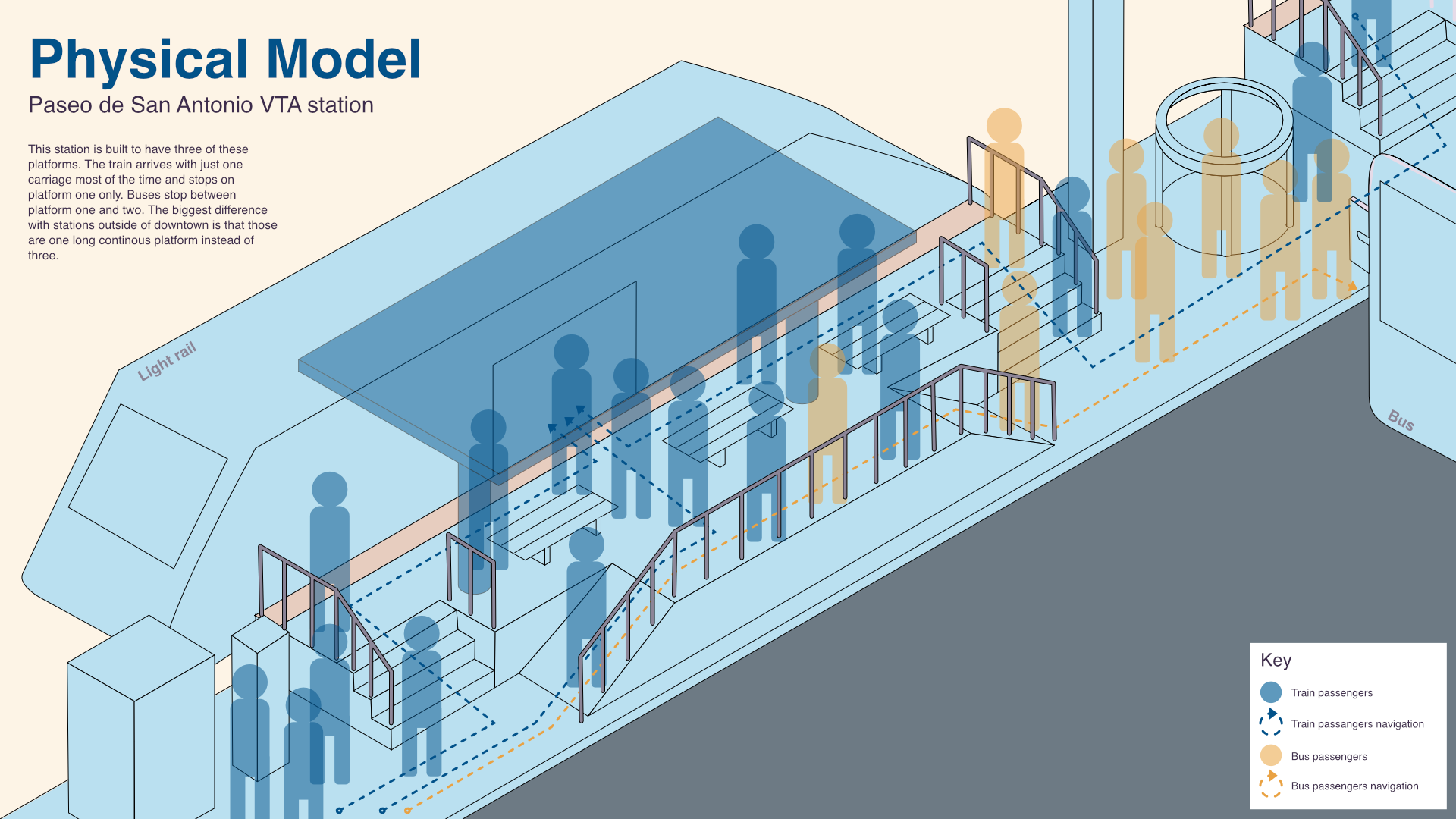
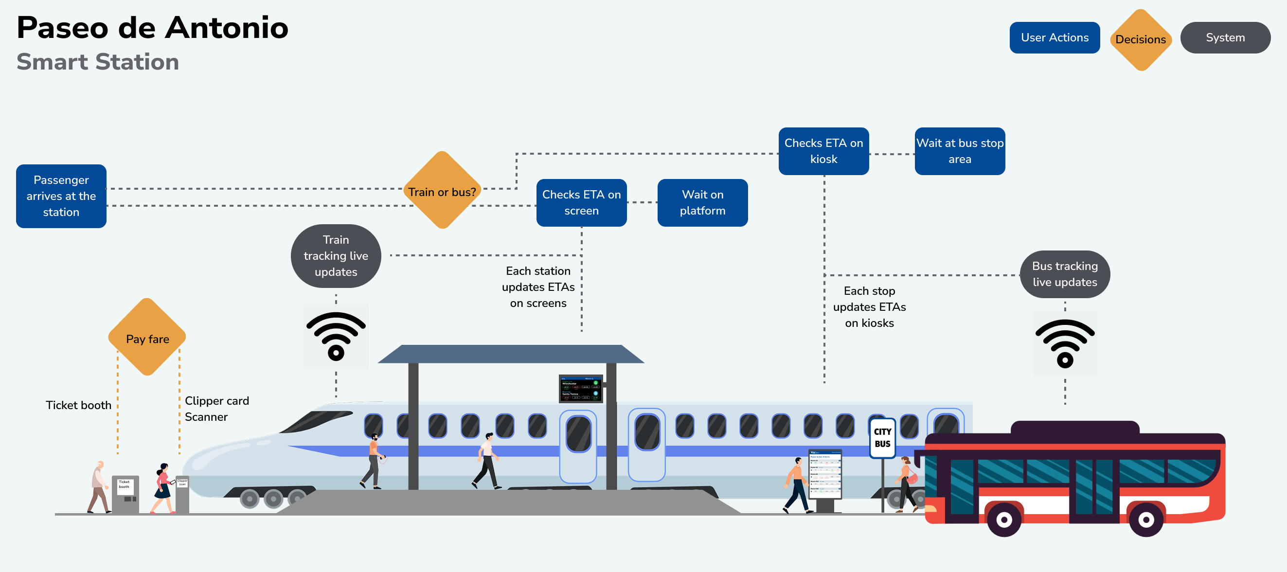
The following model shows the current design of the station. The station is divided in 3 platforms. All platforms are for the same train track. Currently VTA runs a single train car on each run, while sometimes they send out 2 train cars, it is not consistent and this is causing people to crowd around a single platform since the other 2 don't see any train cars regularly.
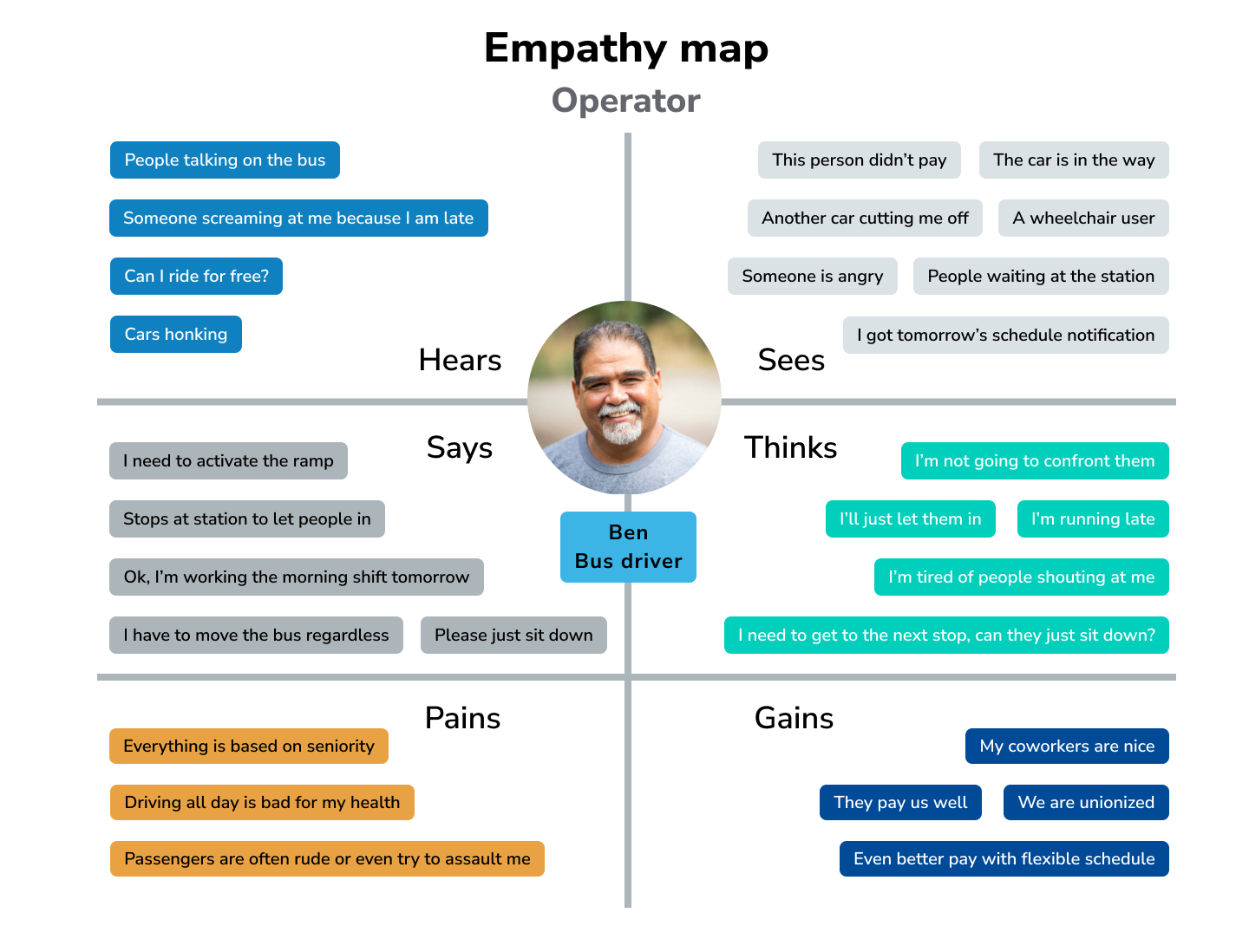
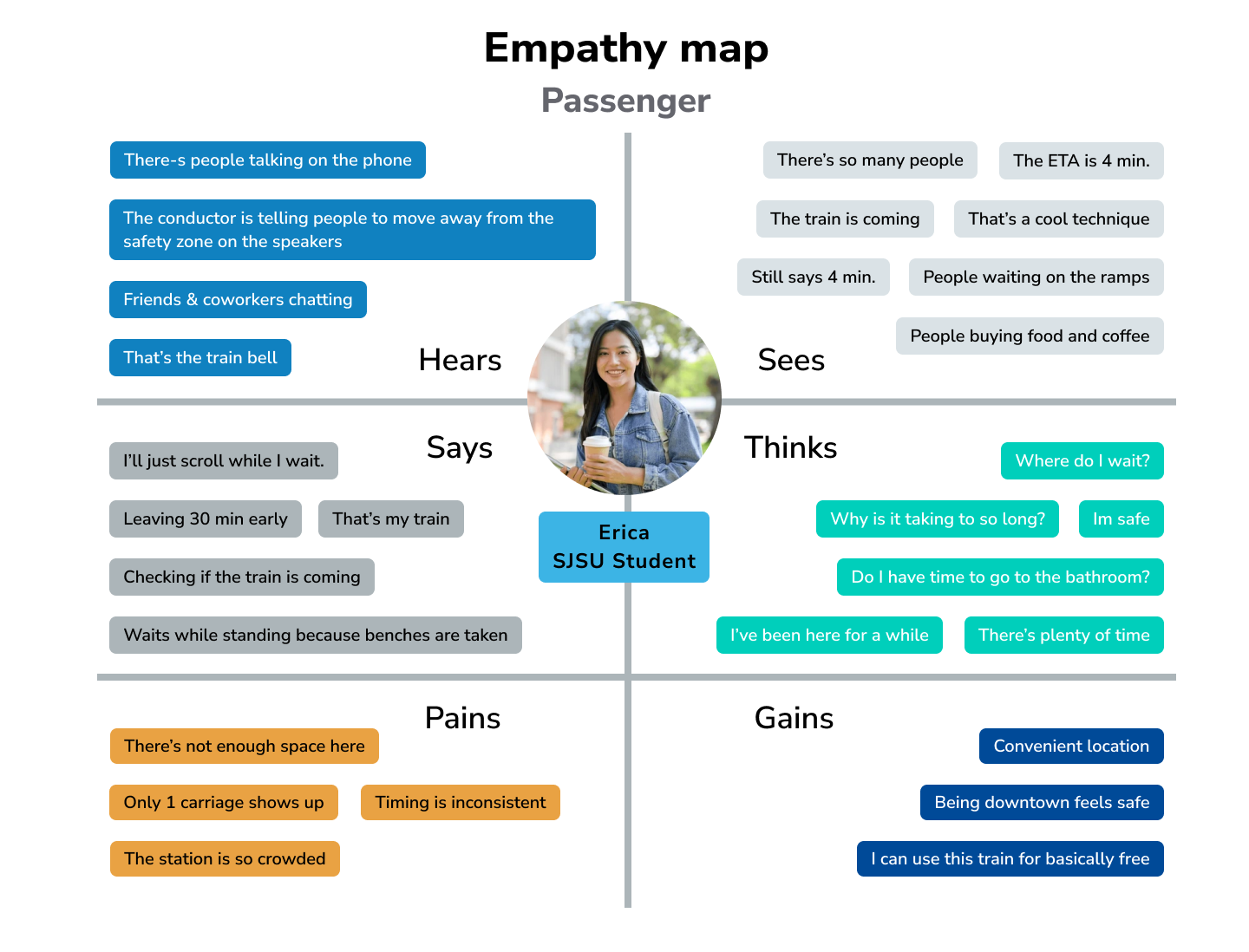
As a result of my primary and secondary research I also created empathy maps of the most frequent passenger type (students) and operators.
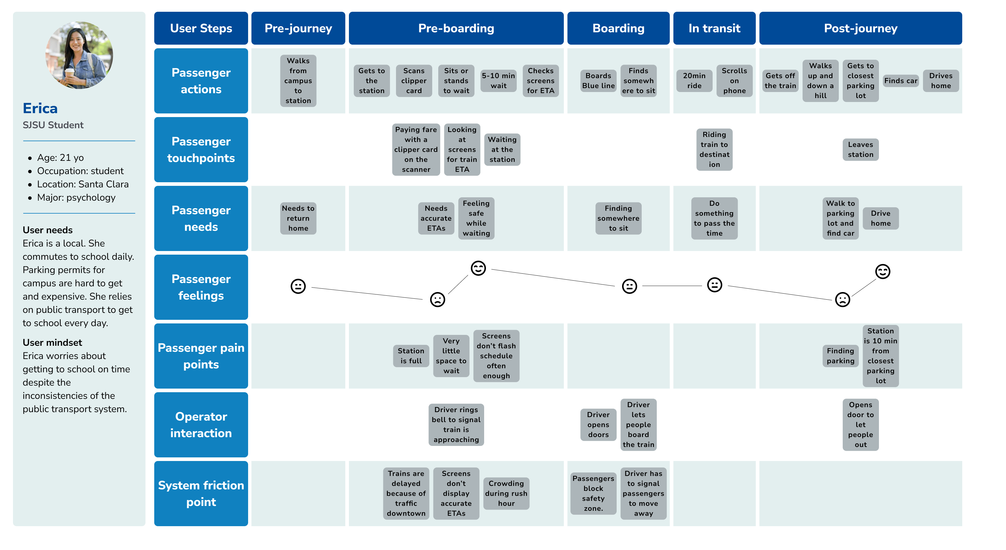
I also created a journey map to visualize the customer journey (commute to school) and their interaction with the service.
The solution
Firstly, I decided to visualize how the new flow of foot traffic would look like at the station with the implementation of more modern tracking systems that allow the electronic signage to display accurate ETA's for both buses and trains.
The hope is that by providing real time updates of how long until the next bus and train arrives, if there are delays or if they are running ahead of time would improve user satisfaction and reduce how much time people are spending waiting for transportation at the station itself.
I created an illustrated flow chart to visualize this new smart system.
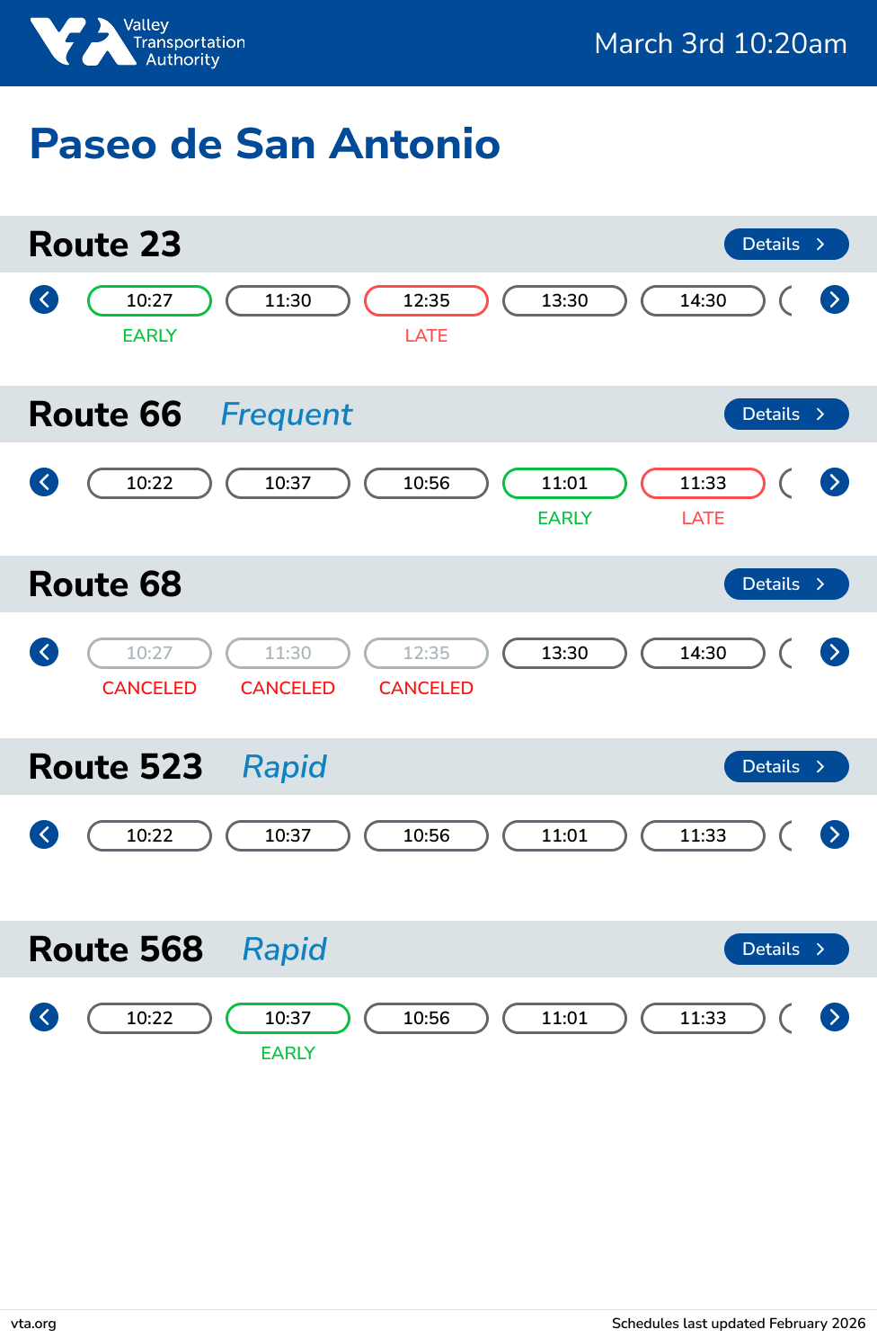
Updated screen designs.
Train dynamic electronic displays. These screens display the current ETA for the light rails. With this redesign I'm addressing users complaints about the screens failing to flash the current schedule with enough frequency. Also acknowledging the importance that ads and announcements have for the company.
These screen will automatically rotate on the screens.
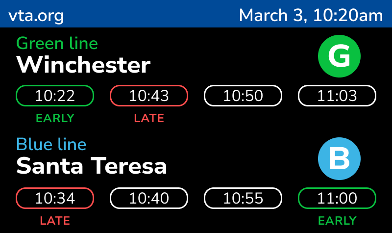
Main schedule screen
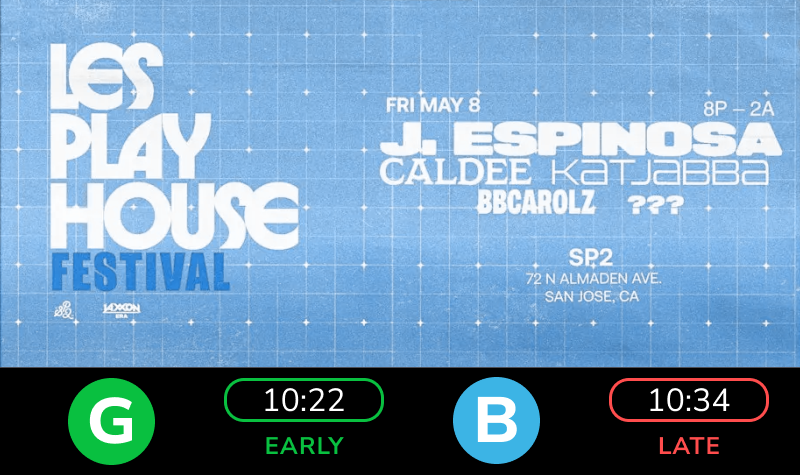
Ad screens still display the ETA for the next train for each line.
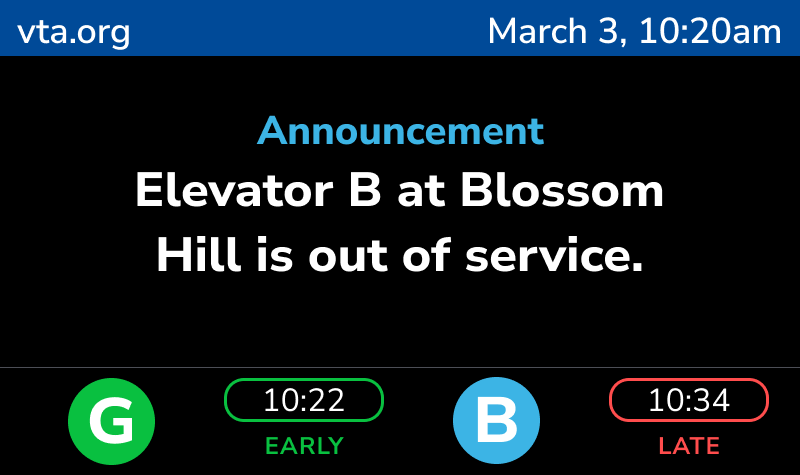
Announcement screens will also display the next trains ETAs'.
Next are the bus displays. Several bus routes visit this station, however only one route had signage with the schedule at the station, leaving users to guess, ask other commuters or check online to find which routes stop by at this location.
For my solution, I'm proposing the implementation of an interactive kiosk where users are able to check schedules and routes for each bus route.
Main schedule screen
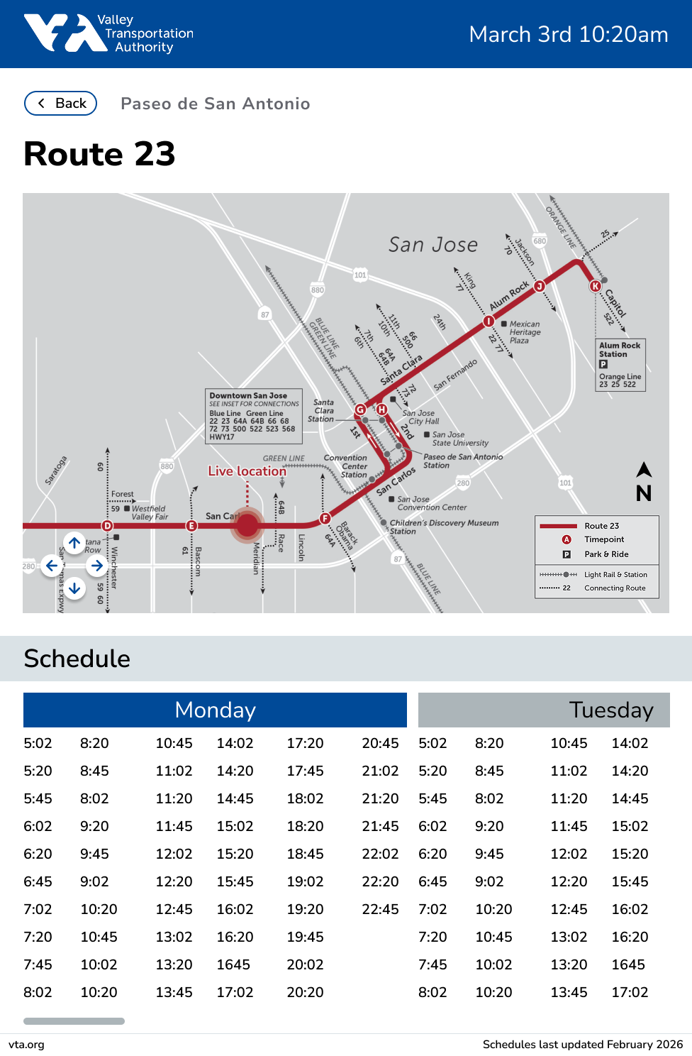
Detailed view.


