.png)
Back to projects
Accessible QDAS
Project Background
This project is in collaboration with the American Foundation for the Blind.
The researchers that work at AFB are blind or low vision which excludes them from using popular Qualitative Data Analysis Software (QDAS) available in the market. This makes their workflow slow, inefficient and overall frustrating. They have had to figure out multiple workarouds to complete their tasks using Word, Excel and Google Drive.
This project will be handed off to the Masters of Computer Science Capstone next year to complete development.
My role: Lead Designer
Contributions:
I created Wireframes, hi-fi designs, and a design system from scratch for this project. I had to keep in mind keyboard interactions and compatibility with screen readers and magnification software while still making the software aesthetically pleasing and high-contrast.
I was also in charge of creating documentation for all files for handoff.
Problem statement
How might we improve the accessibility and efficiency of qualitative research workflows, with a focus on transcript coding and analysis, for blind and low vision (BLV) researchers at AFB?
Research
We conducted several research activities for this project
- Literature review
- Competitive Analysis
- Shadow/Observation sessions
- Interviews
Research insights summary

The current workflow is an adaptive response to the limitations of the available QDAS tools.

The team prioritized participation, accessibility, and learnability.

A central tension is the need to support both accessibility and methodological rigor.
Design
Co-design workshop
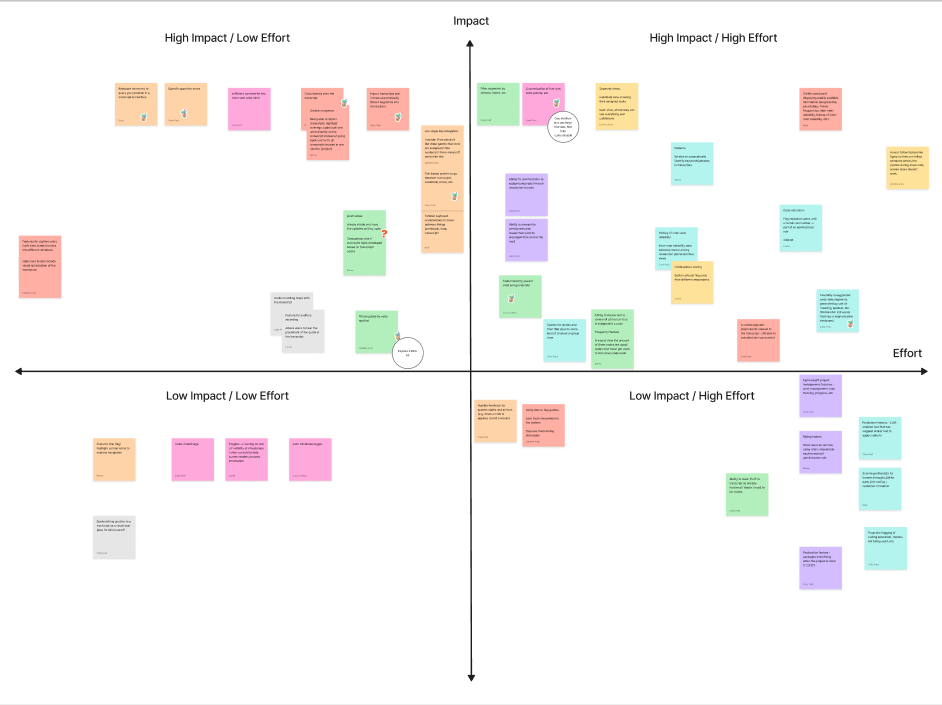
We started the design phase by conducting a Co-Design workshop with the AFB team of researchers. The workshop had to be accessible for all the members so we opted for a Google Docs worksheet approach. We gave them some prompts and we had an open discussion about what features they would like to have for their software. After the Workshop we created an effort vs impact matrix to prioritize what we would work on this quarter.
Pain points

Individuals
- Disorienting to navigate between windows - lose their place
- Different platforms don’t work for different people
- Admin work is burdensome and done by hand
- Everything is spread out, meaning lots of copying and pasting between windows

Collaboration
- Hard to work on the same thing at the same time
- No easy way to review others’ work
- Every team member uses different tools hence version control is difficult
Low-fidelity prototype
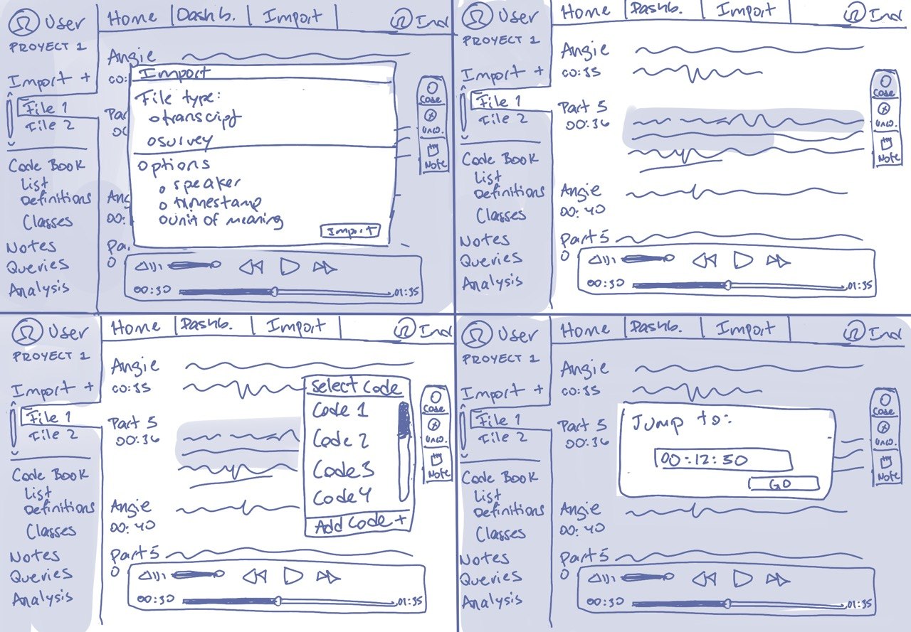
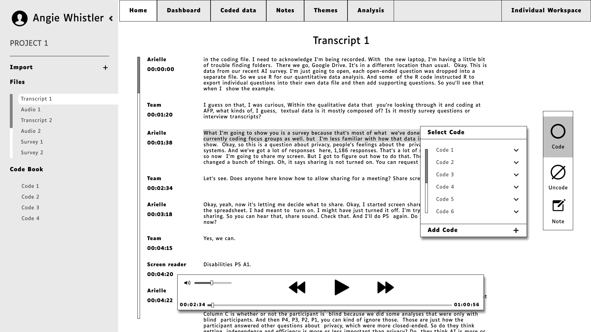
After the workshop I sketched some wireframes to brainstorm ideas and then made a higher fidelity version in black and white.
Features included
- Tab-based organization and single keystroke navigation / location querying
- Ability to code and take notes directly on the transcript
- Individual tabs for coded data, notes and overarching themes
User testing
We took this first prototype to validate it with out users and get some feedback. We interviewed 3 researchers for this test, 1 sighted, 1 blind and 1 low vision to get perspectives from all of our user types.
Round 1 findings:
- Coding notes and overarching themes notes are different types of notes, so they should be separate.
- Notes should always be visible to the team
- Minimize navigating across the screen for magnification users.
- Varying preferences on codebook visibility
- Prioritize team wide features vs admin features.
Functionality prototype
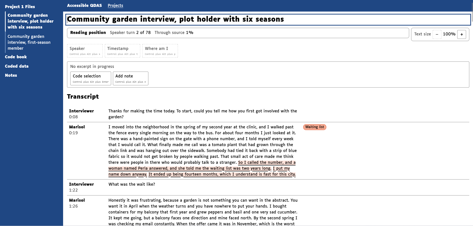
From these findings we worked on a higher fidelity web prototype using Claude Code. We took this and tested the functionality. We were able to test compatibility with screen readers and magnification users. The necessity for this prototype comes form the issue that Figma prototyping system doesn't accommodate screen readers, nor is it possible to have it play confirmation sounds. This prototype will be a functionality reference for the Software Eng. team.
Round 2 findings:
- Not all screen readers or operating systems handle HTML the same way. Further testing needs to be done for correct implementation of a native app.
- Code book hierarchy was confusing and inconsistent across pages
- Having to scroll through a whole list of codes to reach the note button is inefficient.
- Underlines for linked text is necessary and doesn’t impact readability
- Admin: needs to check for code discrepancy
- In notes page: distinction between quoted text and researcher note is not obvious.
- Screen reader needs to announce an excerpt is coded before the excerpt is read.
Design System
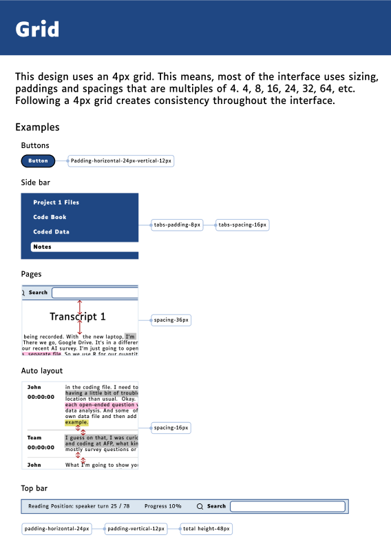
Since this project is being handed off to the Software Engineering Master's program at UCI. It was important to document the design in great detail. We created design system from scratch for this project. Here are some examples from the design system itself.
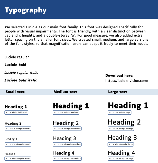
Typography
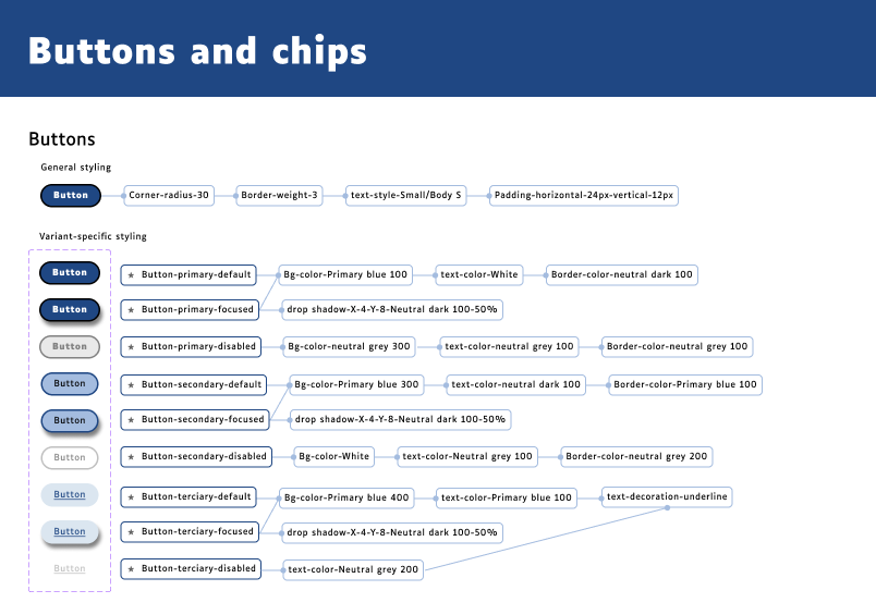
Example of the design tokens
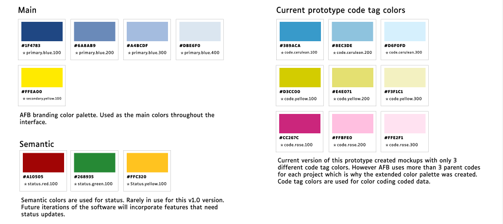
Color palette
Final Figma prototype
This is the final clean version of the protoype created in Figma. This design will be handed over to the SE Master's to guide them for how the software should end up looking from a visual perspective.
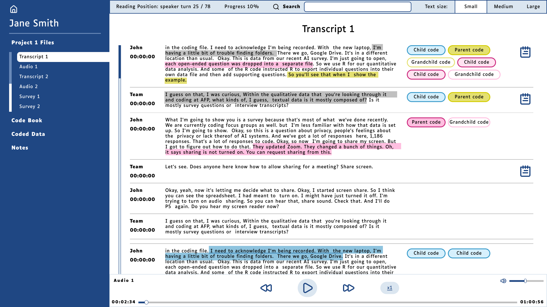
Transcript screen. This screen is where the researcher can read, select and apply codes to excerpts.
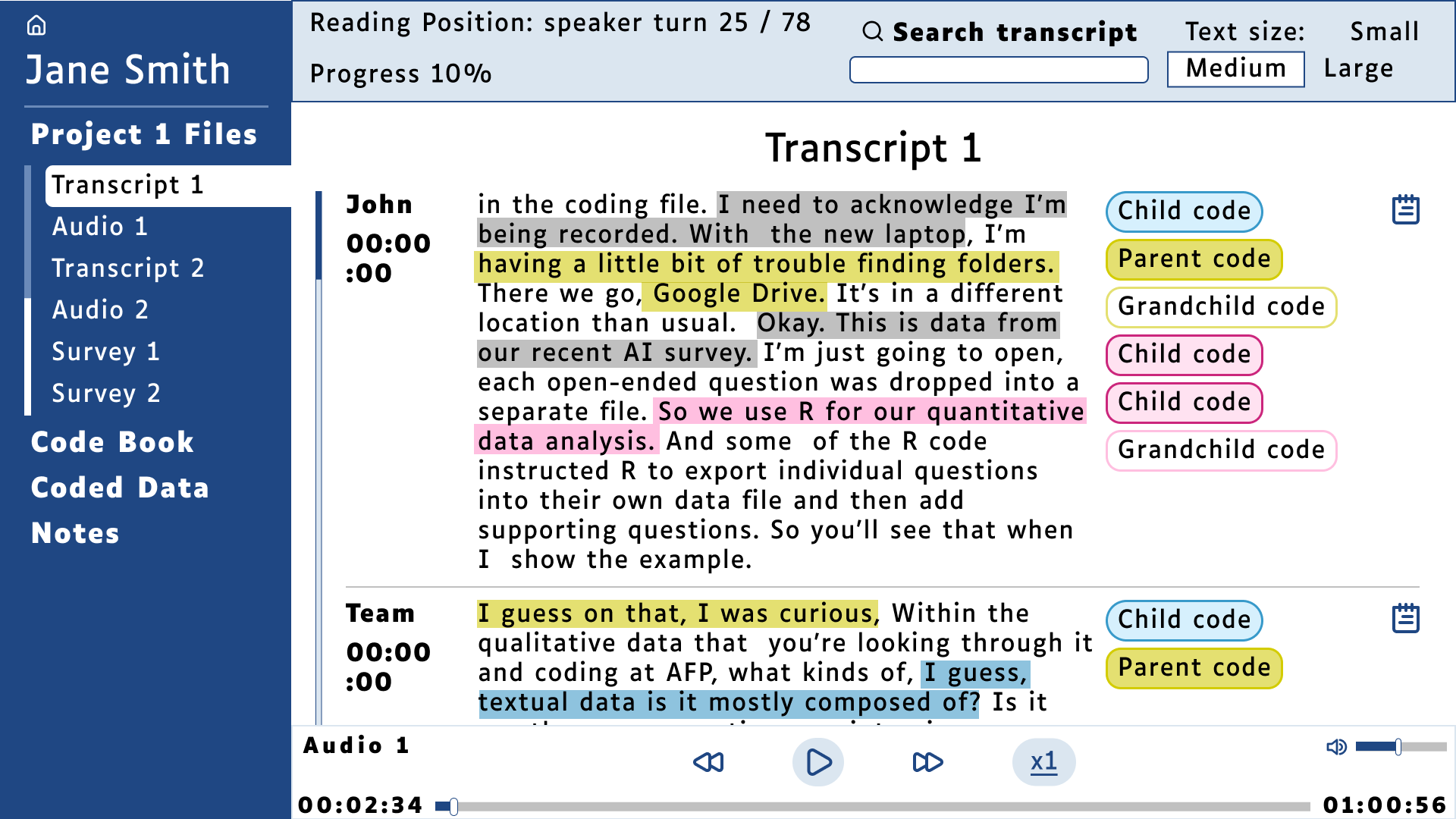
Transcript screen. Large text version
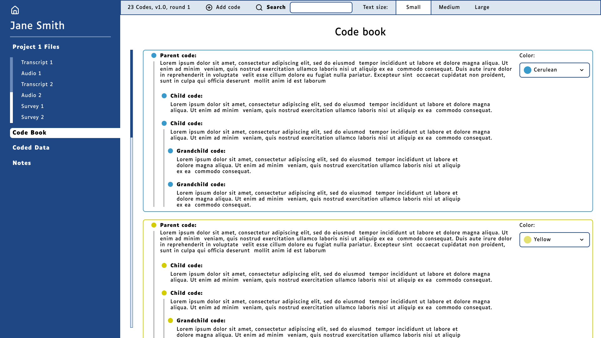
Code book page. This screen lists all codes in the code book.
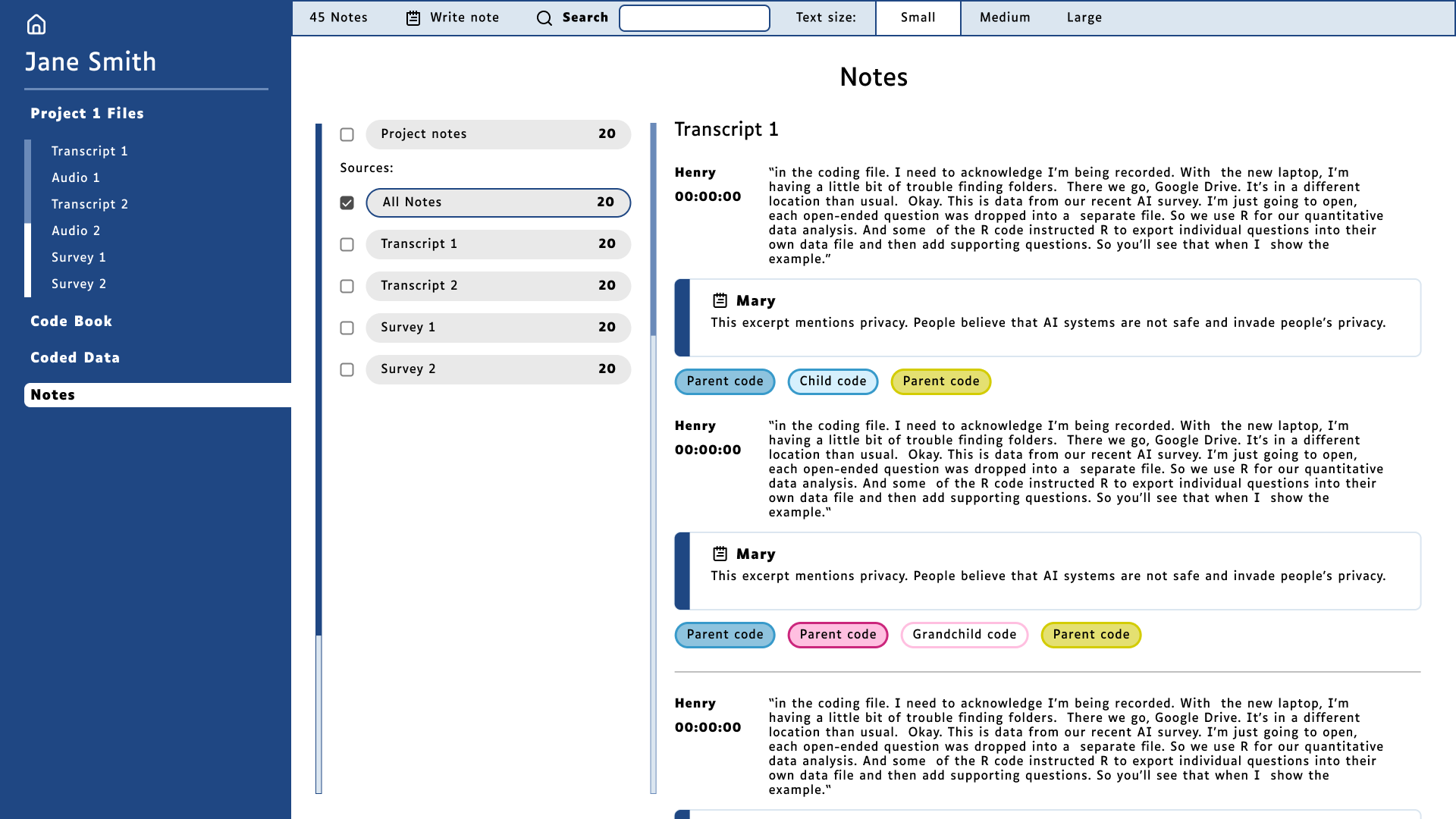
Notes page. In this screen the researchers can review notes left by themselves. Or, in case of the team lead, they can review notes from everyone in the team.
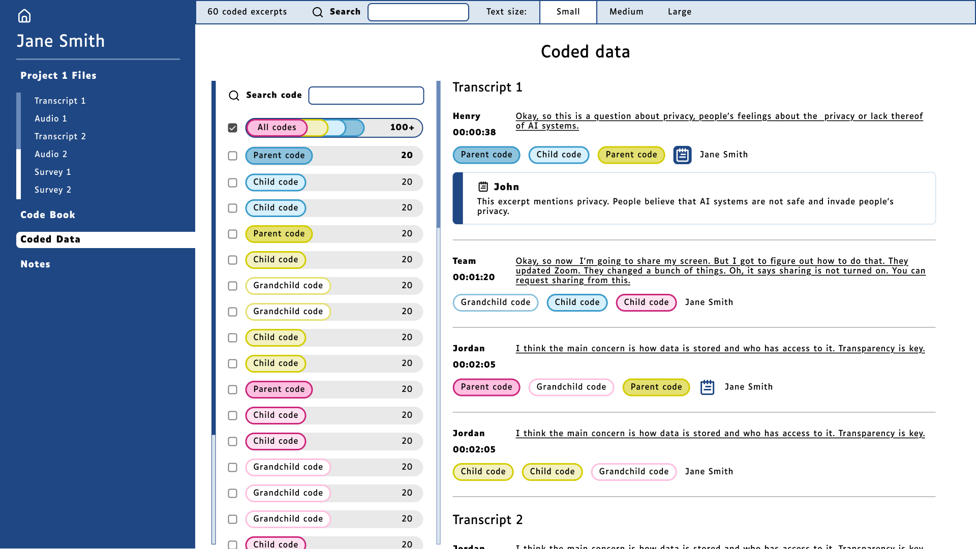
Coded data page. In this page the researcher can filter through the codes to view only the excerpts that include the code they selected.


